DrayEasy Dashboard
Make the last mile easier
Project Type
Part-time at DrayEasy
Team
5 Designers, 1 PM 3 Designers
My Role
UX Designer
Contribution
User Research Prototyping Visual Design
Tool
Figma Figjam
Overview
Context
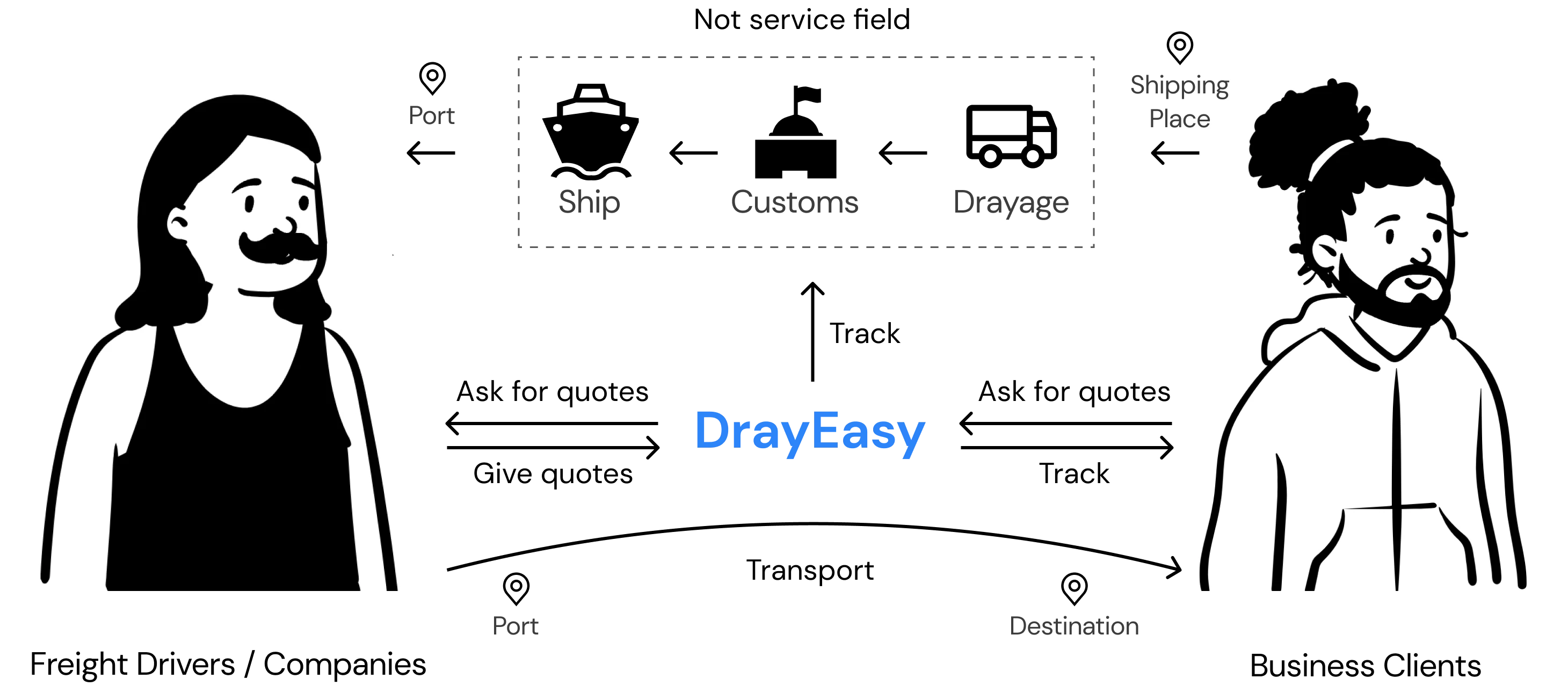
DrayEasy is an online platform that specializes in providing freight forwarding and logistics services. It offers a digital solution for businesses and individuals to manage and streamline their shipping and transportation processes. DrayEasy mainly focus on the "last mile" of the logistics process, which refers to the journey after commodity was shipped to the port.

Stakeholders
Challenges
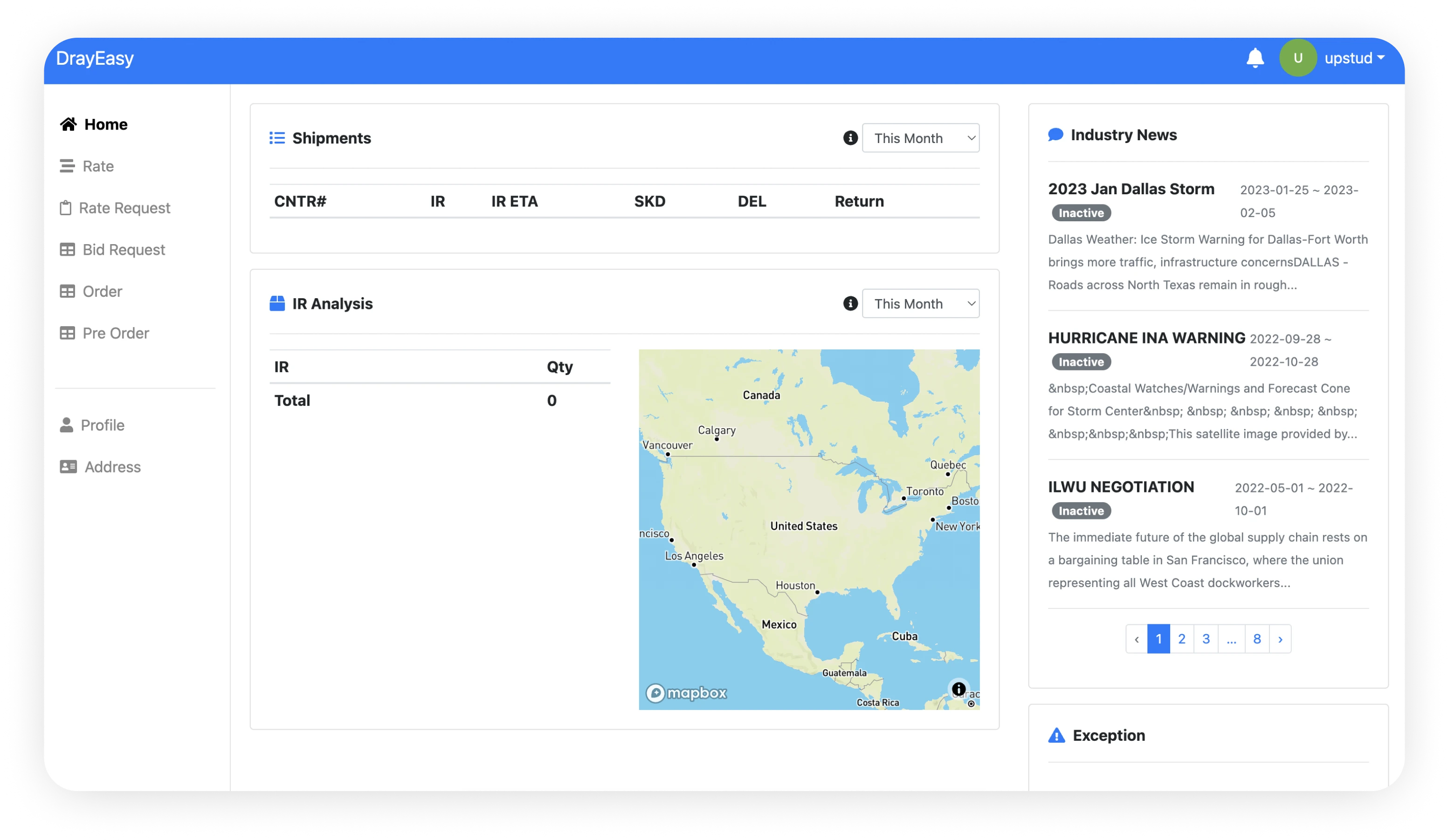
The current DrayEasy dashboard is a minimum viable product which only contains basic functions. The company uses e-mail as the service method as they expect to use a developed platform. Our challenge is to ease the user's understanding and make it easier for them to use. This effectively translates into meaningful business outcomes like increasing conversion rates.
Solution
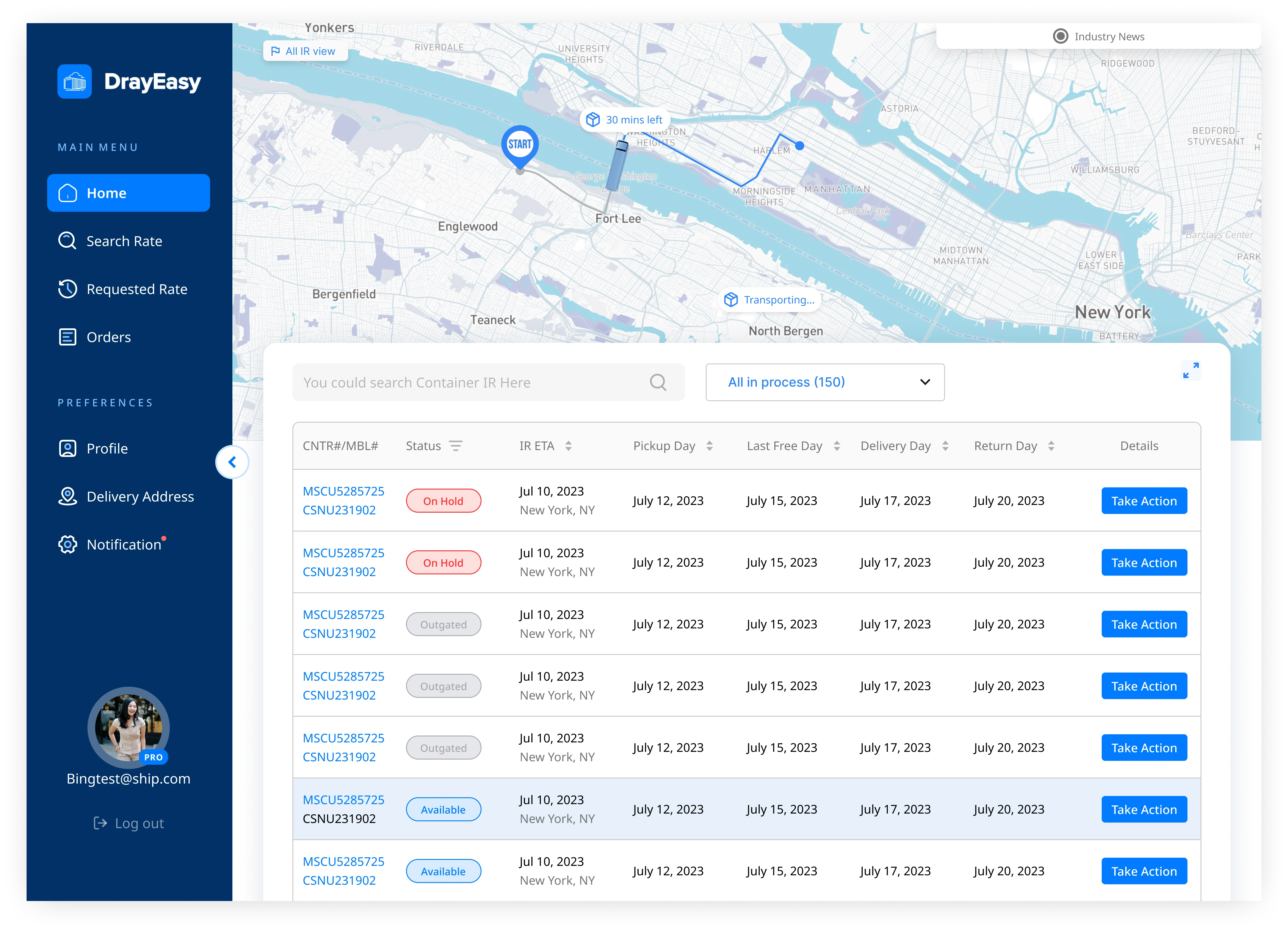
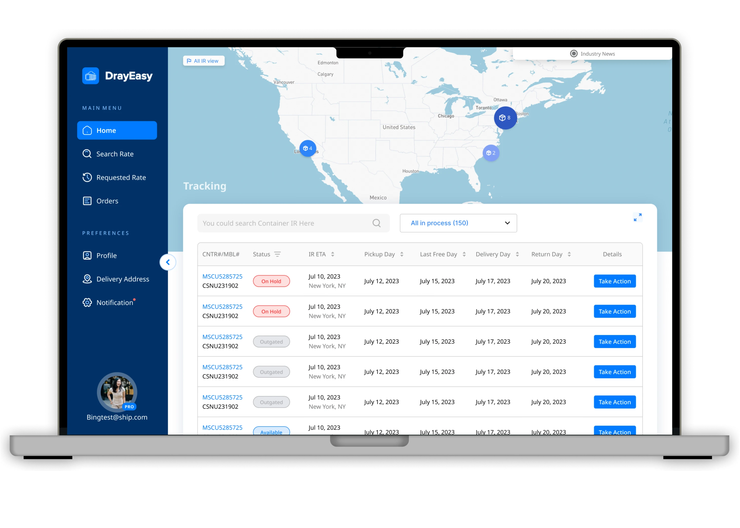
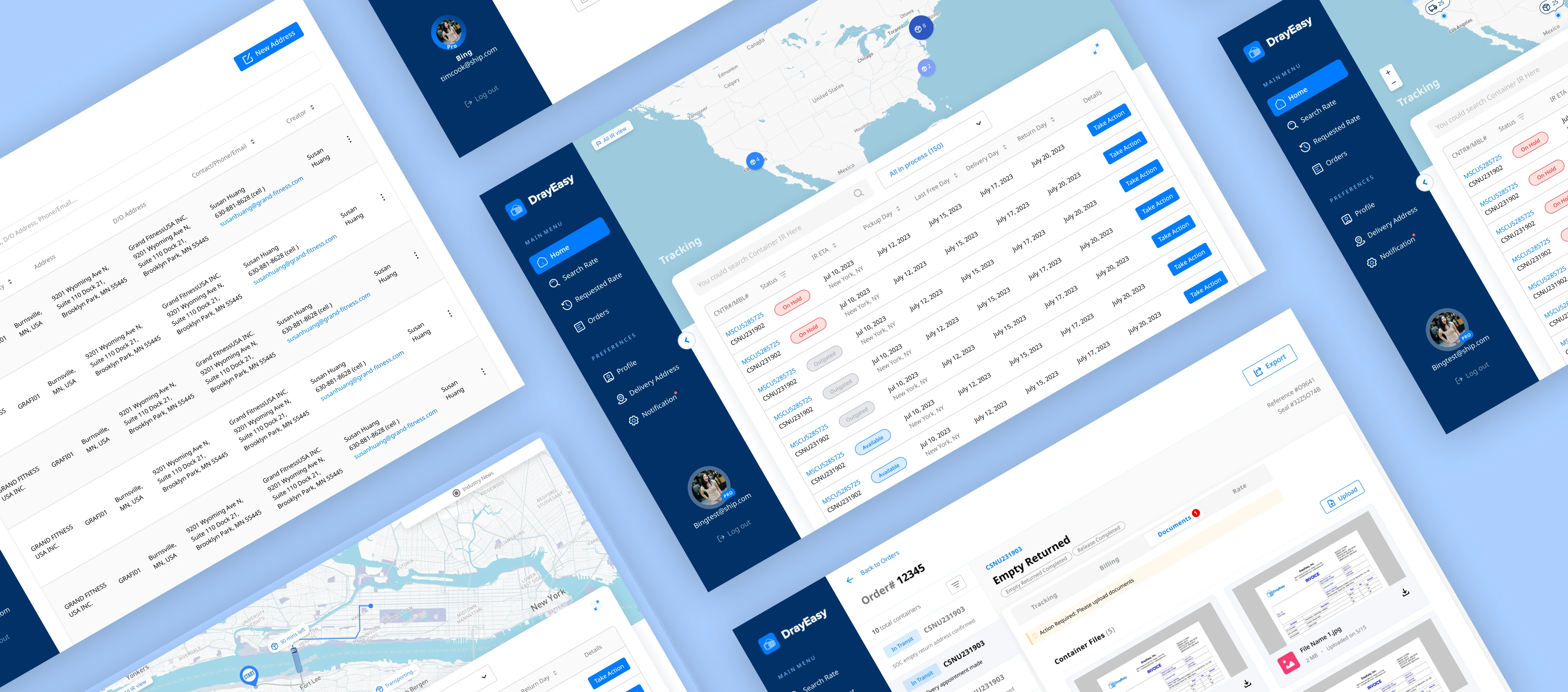
A new dashboard is designed. I took part in the layout iteration and focused on the map design.
Impact
The client has confirmed the design will be released on the new platform version.
Research
User Interview
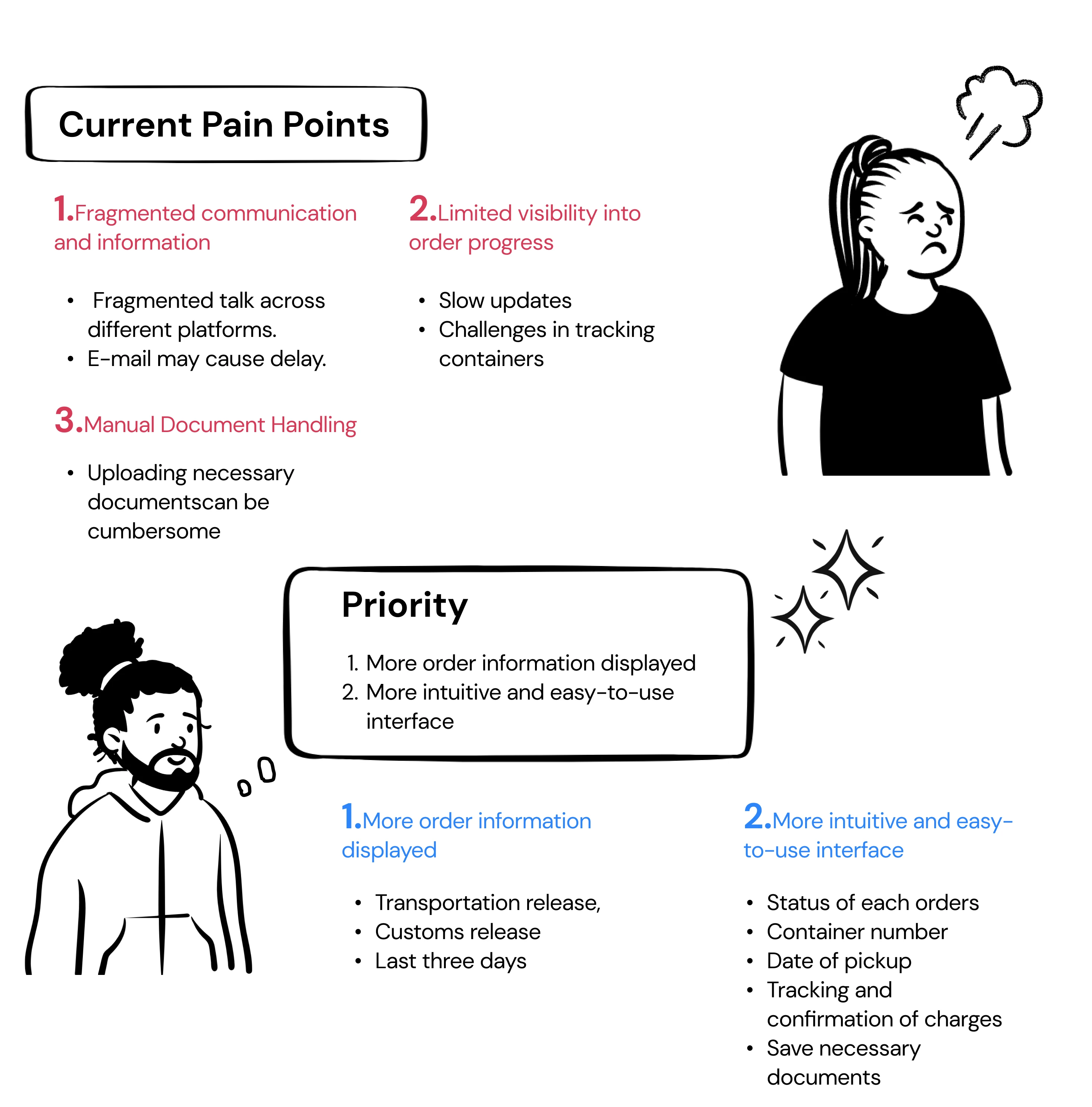
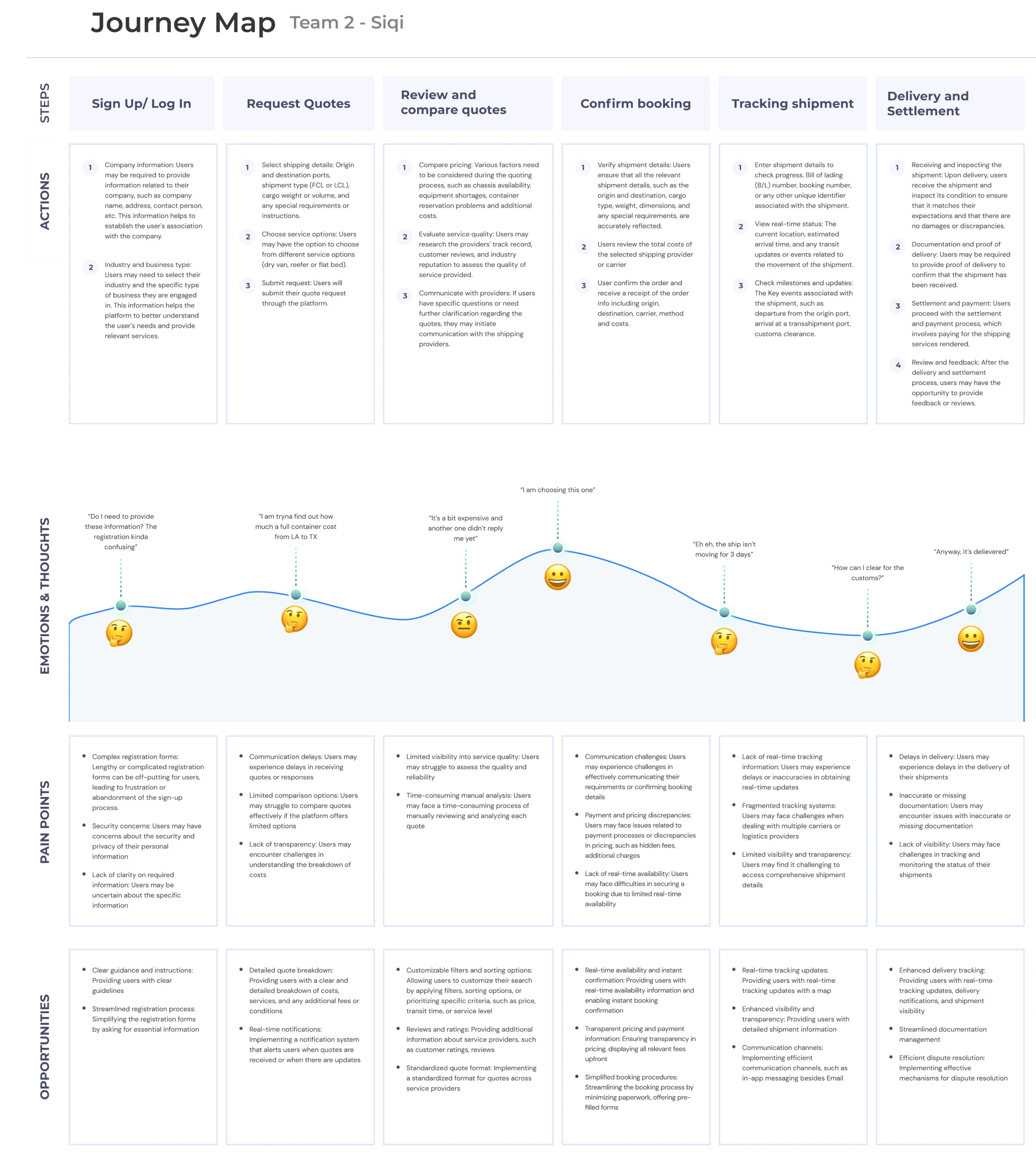
From the interview, it's clear that our clients are concerned about enhancing order tracking and management. The interviewees desire a more informative and user-friendly website that displays updates, suggests adding vital data to the order table, values clear status updates and key dates, and appreciates a saving documents function.
Persona

How might we
Optimize the DrayEasy dashboard to enhance user experience and reduce operational costs?
Ideation
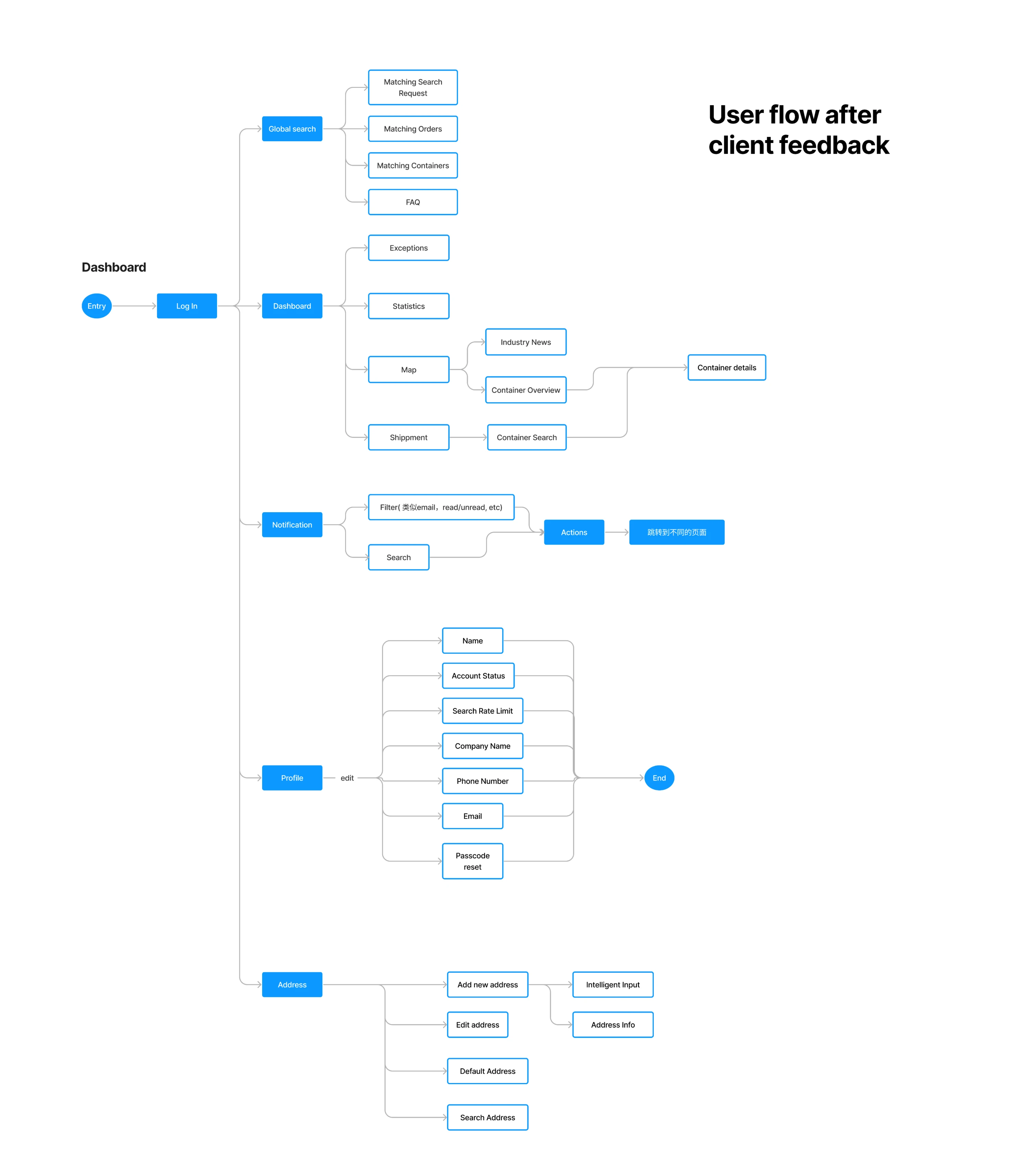
User Flow
Design Iteration
Design Principles

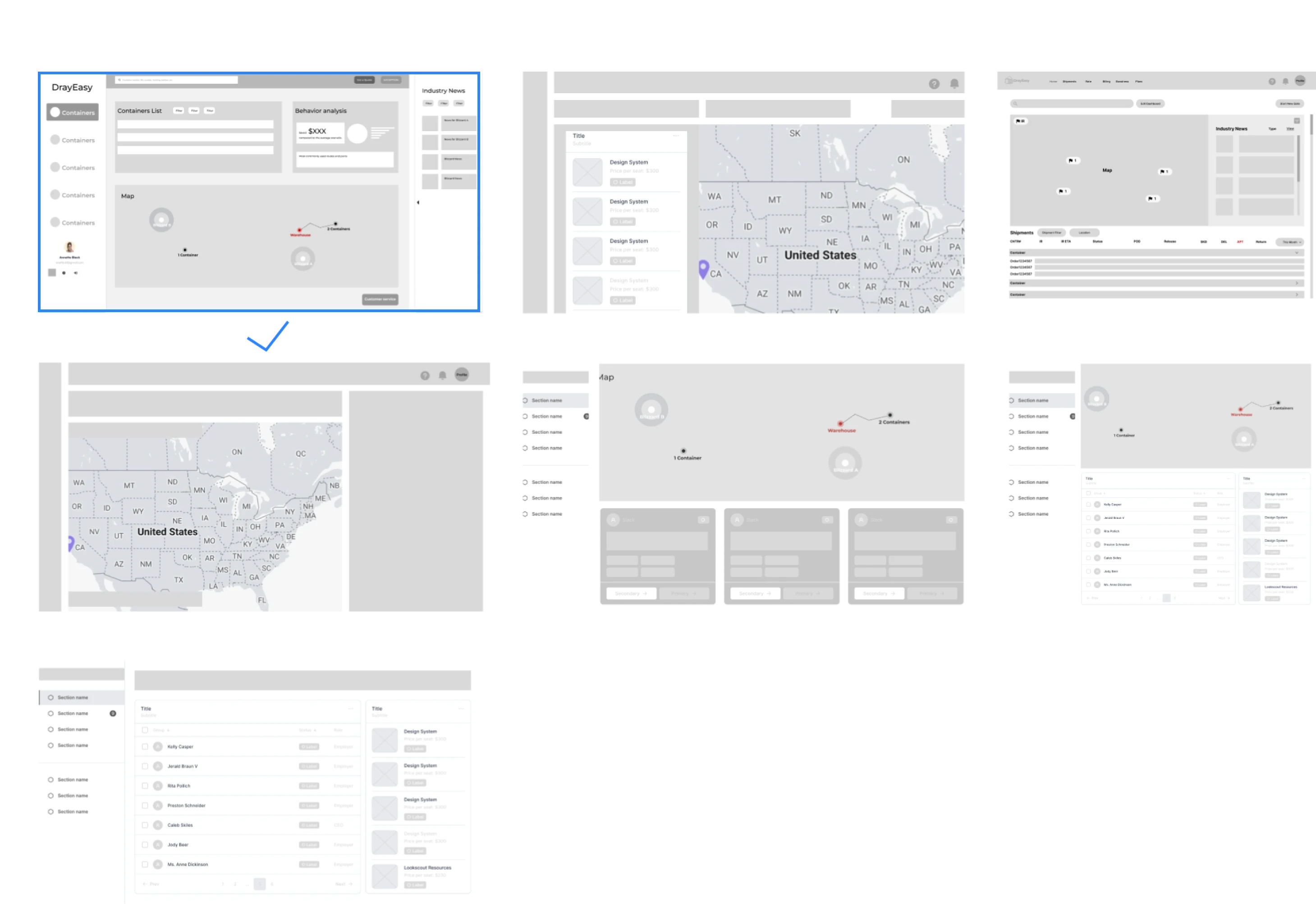
Layout Exploration
Exploring the dashboard layout based on information structure
Feedback
Full width map is better to show more information and interaction.
Industry news doesn’t need to hold such big space. it is not urgent.
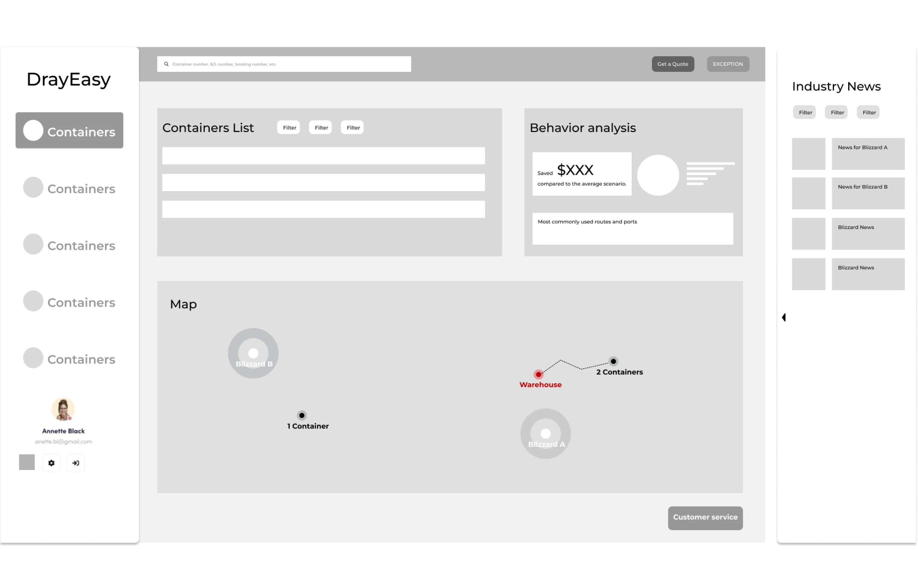
Layout Iteration
v1
v2
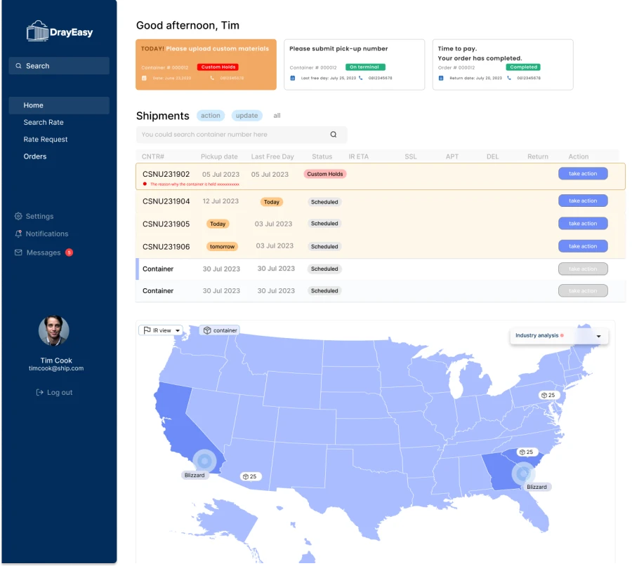
v3
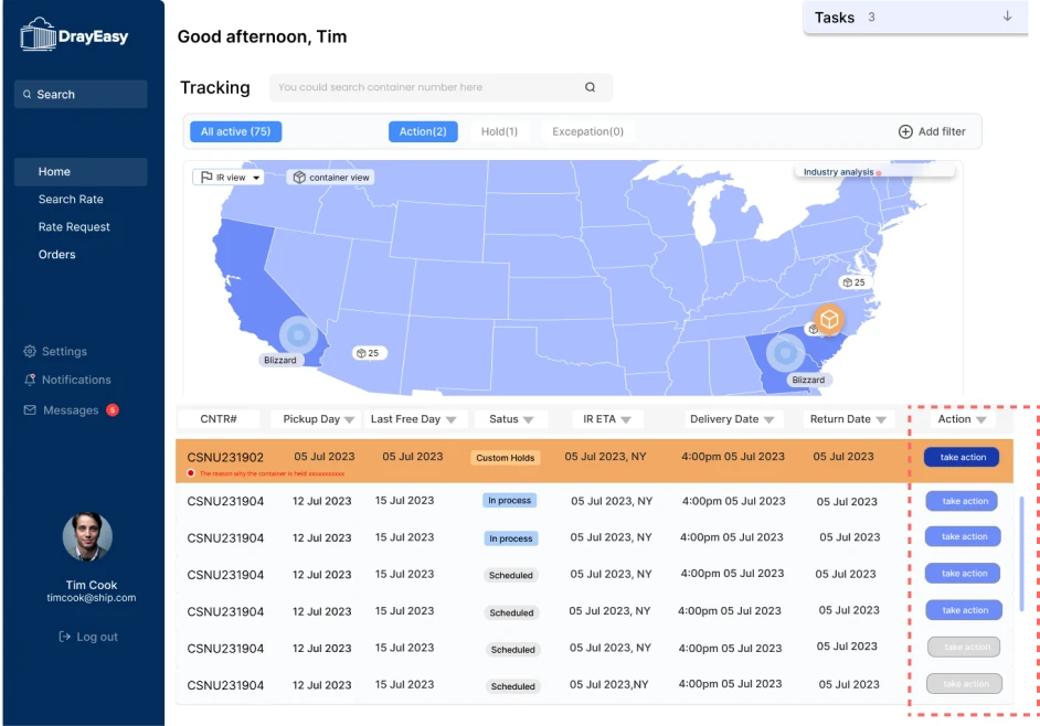
v4
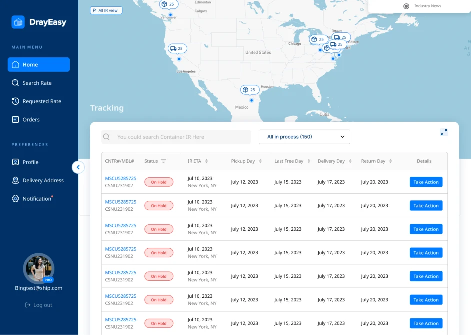
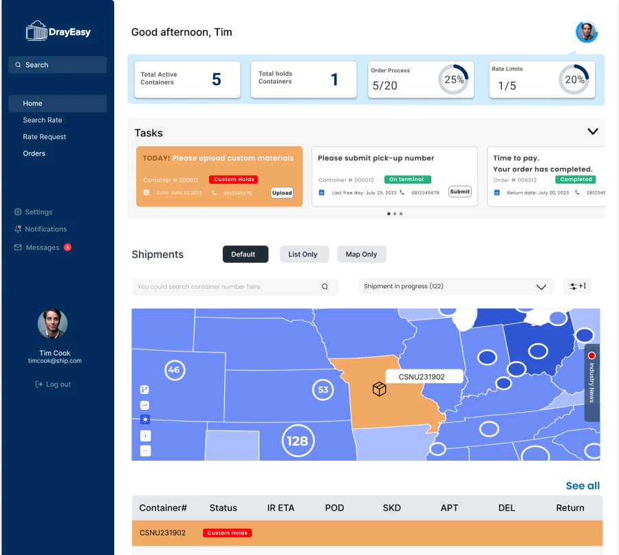
The general iteration idea is to leave more space and attention for map. As a result, the map is on the top of table, the data cards are removed and the industry news will show while the mouse is hovering.
Map Principles
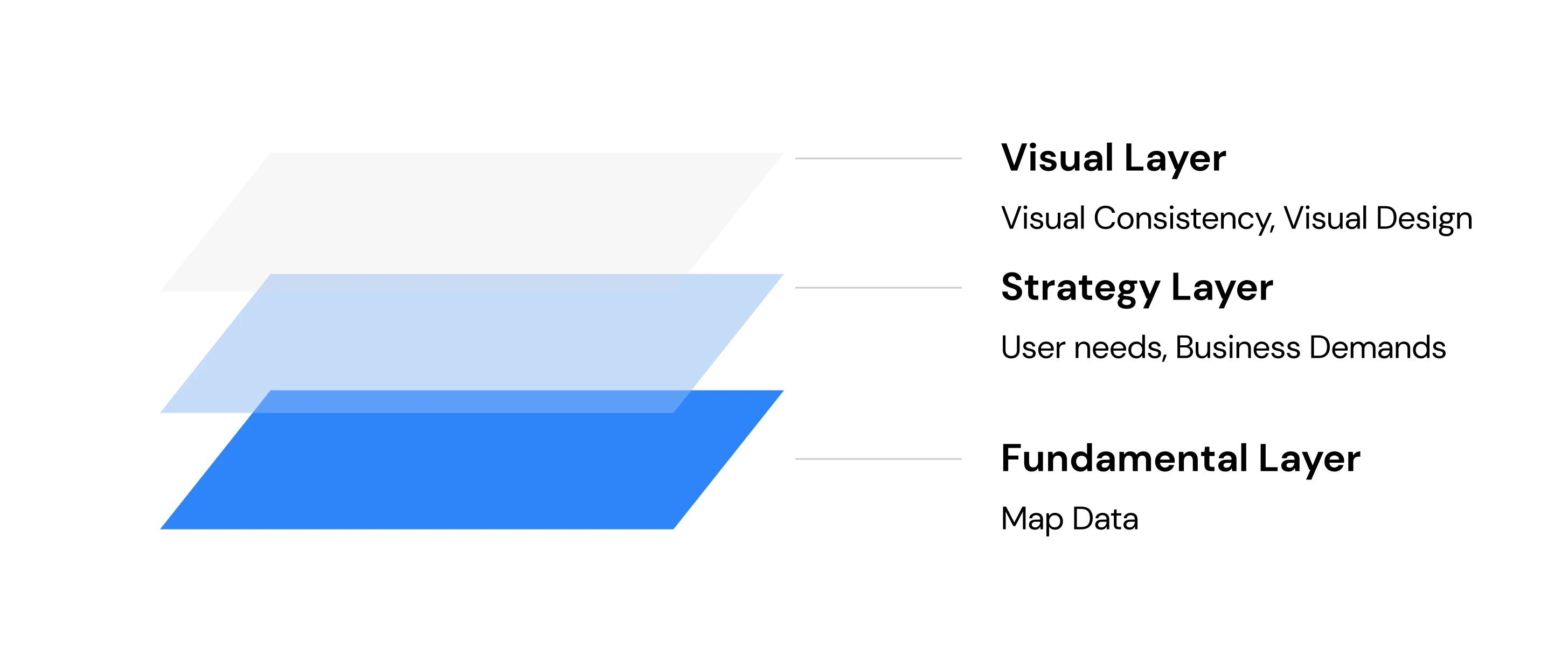
Map information is complex, and the production of good maps requires collaboration among multiple parties at three levels: data support, functional design, and sensory communication.
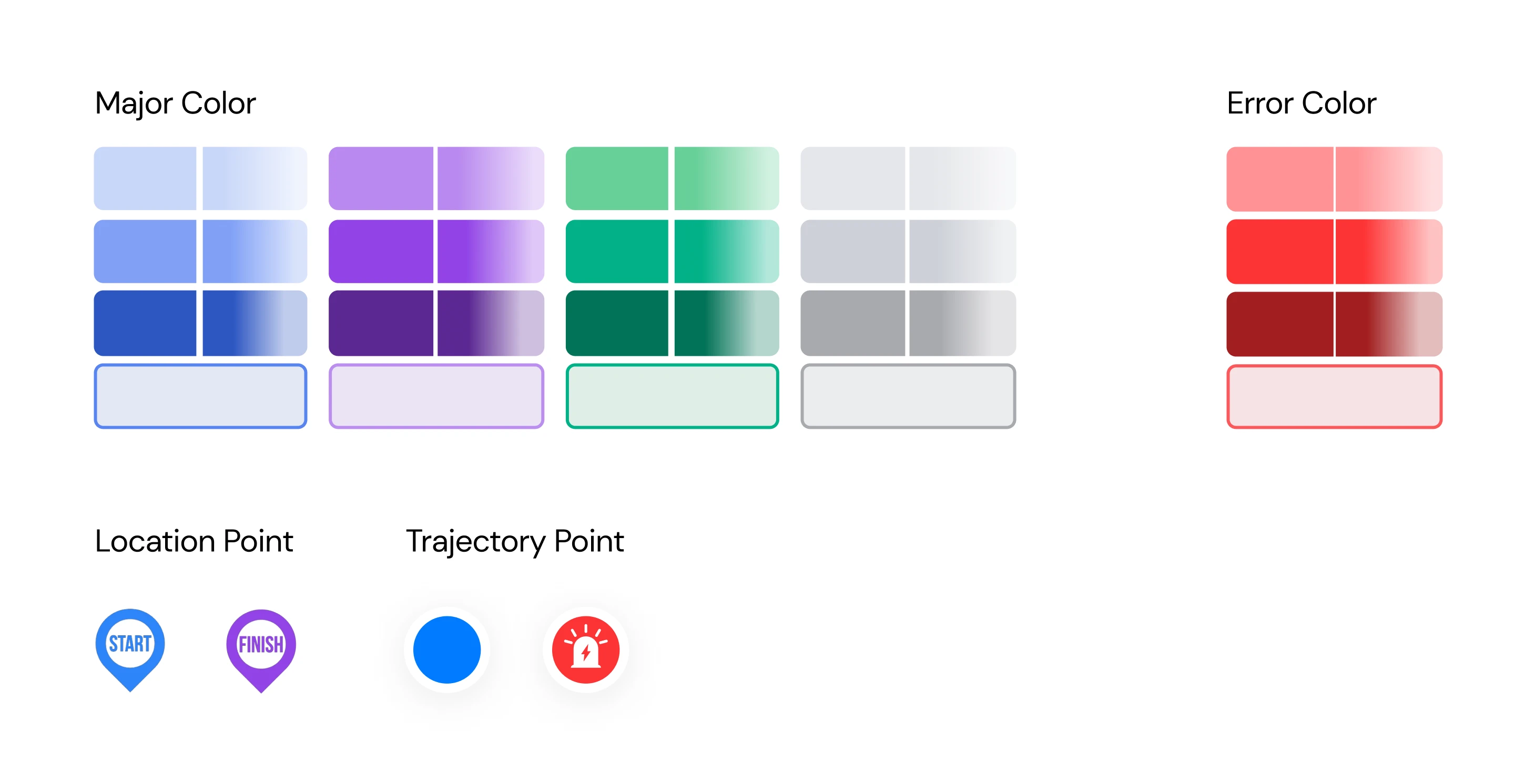
Design System
Main Color: Based on cold colors, and cold colors with differences in hue for displaying different categories;
Error color: Used to flag anomalies.
Position points: Used to convey location information, maximizes the informationand reduces content occlusion;
Trajectory points: It is the point where the location information is selected and the track is recorded
Final Design
Map Design
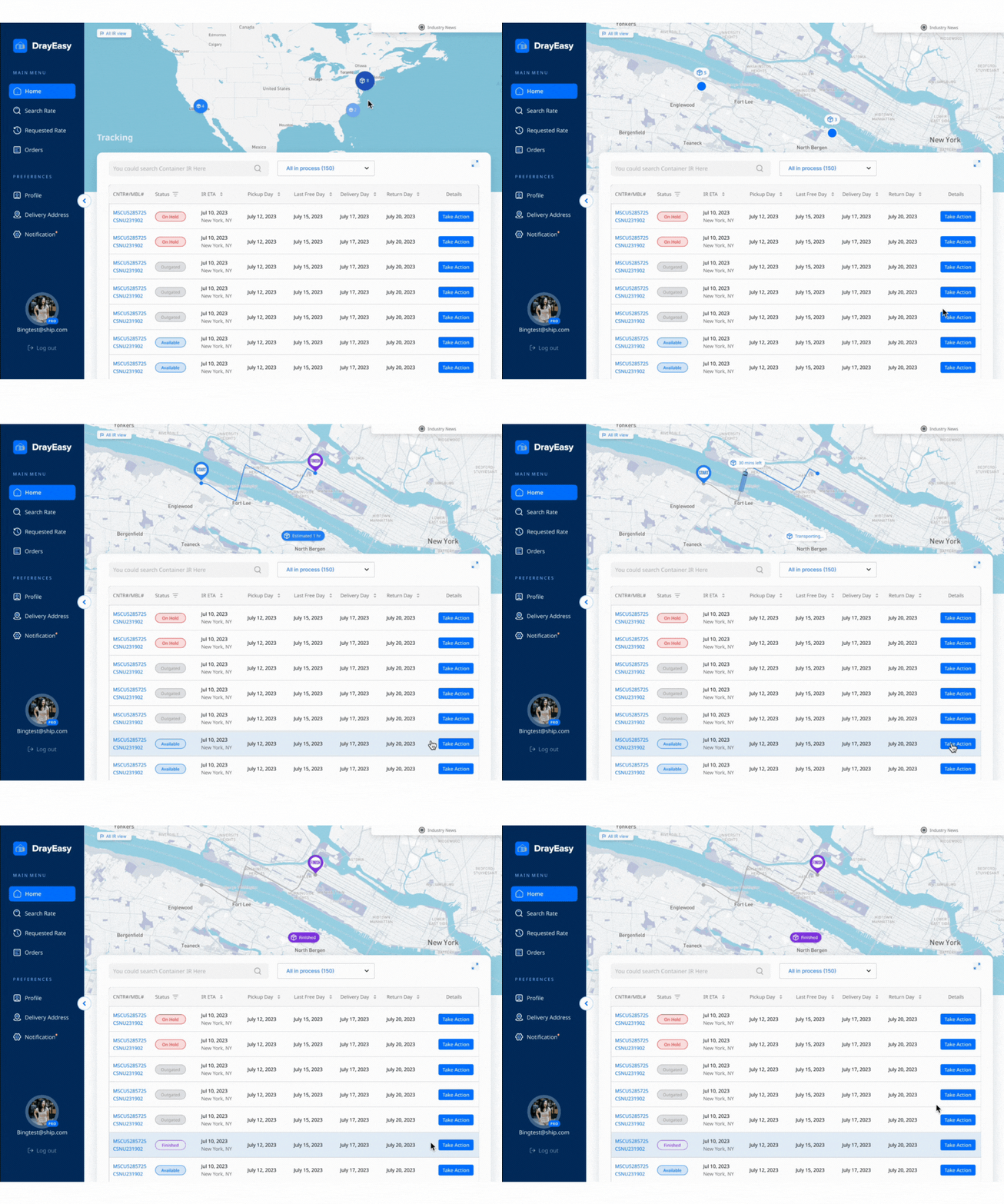
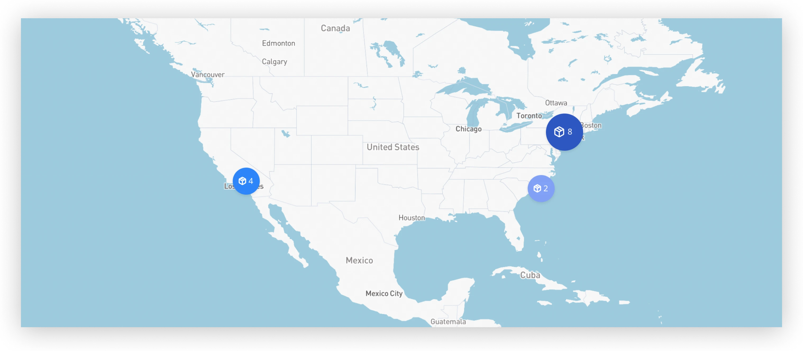
1.There are quantifiable indicators on the system map that need to be distinguished by color contrast. The darker the color scale, the larger the icon/number of icons.
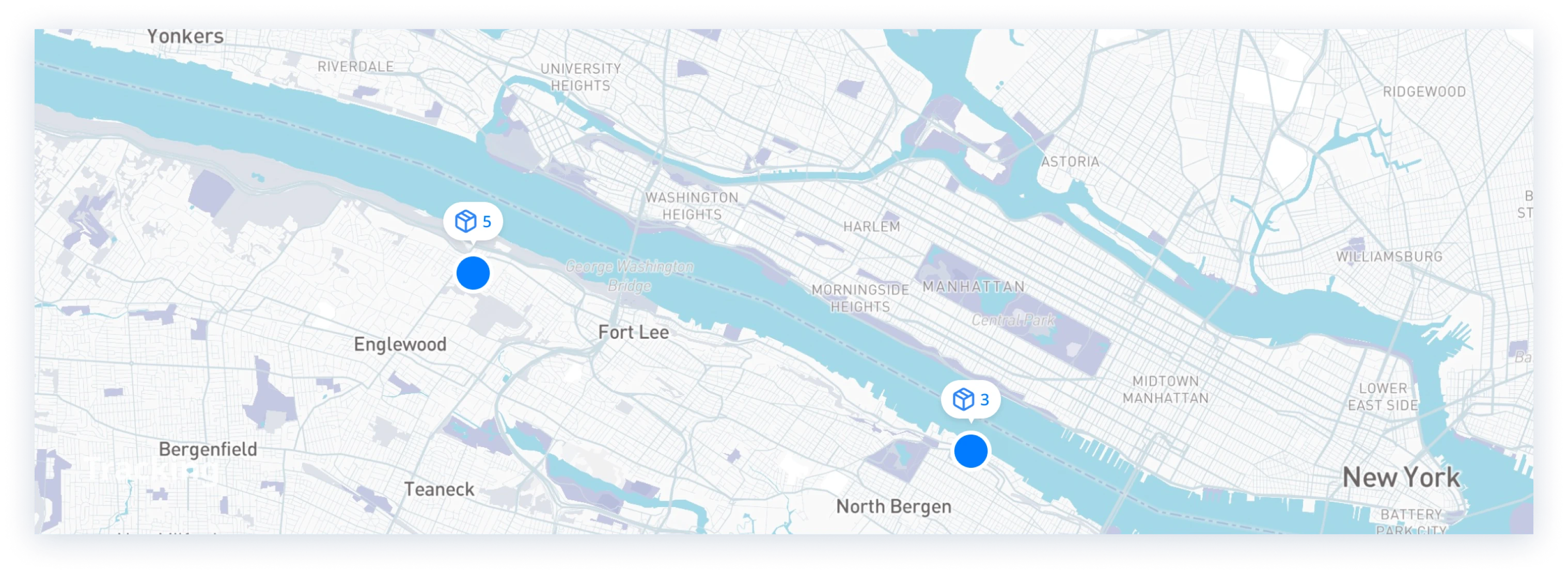
2.See the port/warehouse containers' at.
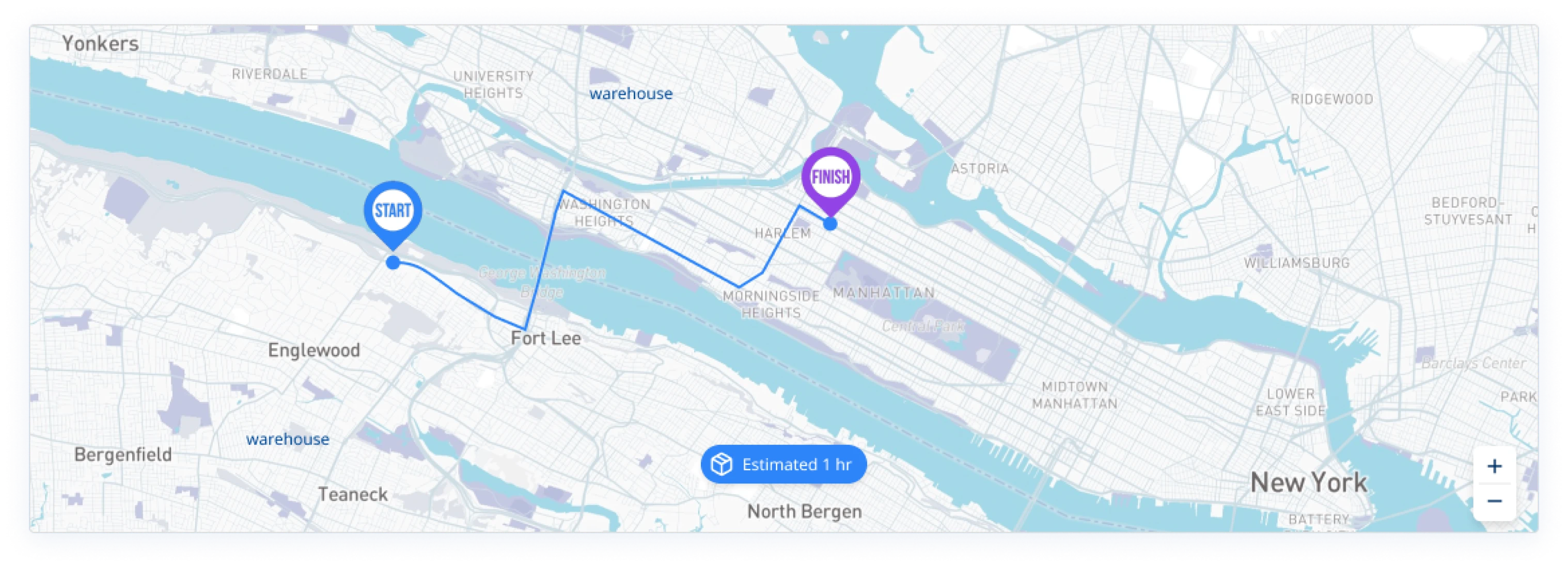
3.Choose a container to deliever, and starting point and destination are showed on map.
4.A truck shows the progress of the route and time remaining.
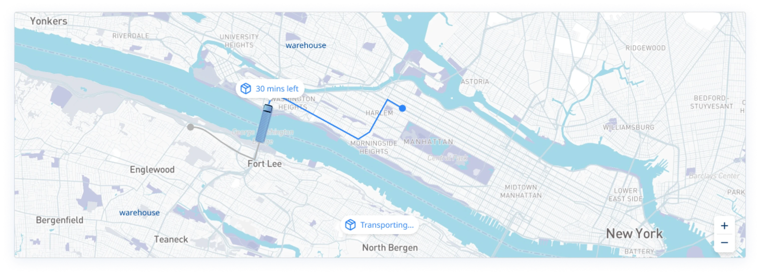
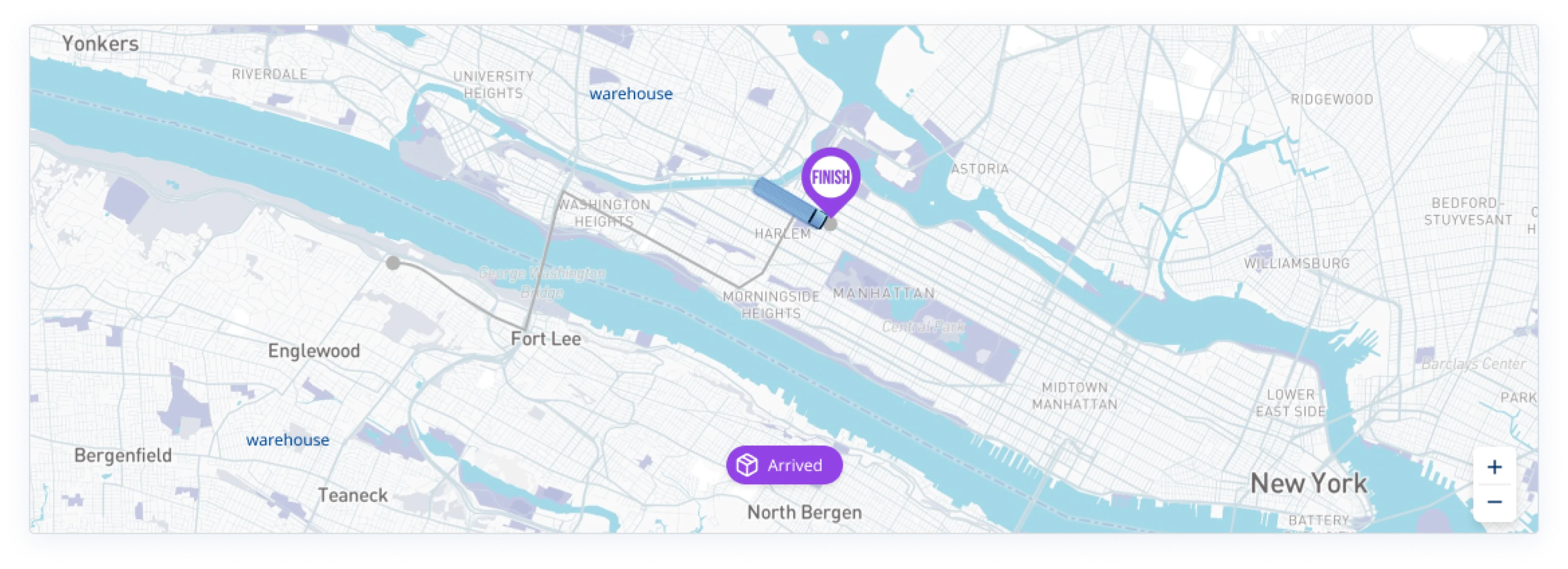
5. Delievery finnished.
Dashboard Design
