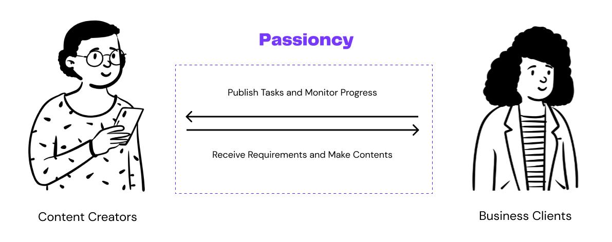
Passioncy
Bridge together clients and creators for short video strategies.
Project Type
Intern Project
Team
3 Engineers, 1 PM 3 Designers
My Role
UX Engineer
Contribution
User Research Prototyping Visual Design Web App Development
Tool
Figma Javascript React
Overview
Context
Customers love watching videos while shopping because they find them visually appealing, entertaining, and informative. Videos build authenticity, trust, and social proof, making the shopping experience enjoyable and influencing purchasing decisions. Brands leverage videos to educate, personalize, and create compelling narratives for better customer satisfaction.
94%
of people have watched an explainer video to learn more about a product or service
84%
of consumers surveyed were convinced to buy a product or service after watching a brand’s video
Stakeholders
Challenges
Firstly, we need to ensure that the increased traffic effectively translates into meaningful business outcomes by optimizing conversion rates. Secondly, justifying the investment in the redesign becomes crucial for the success of the project. Sustaining long-term traffic growth is an ongoing goal that requires continuous efforts in marketing and engagement.
Solution
The dashboard of the business side helps to find qualified influencers, to monitor the creation quality and keep communication fluent.
Impact
217%
achieved an impressive 217% increase in user engagement
5%
conversion rate has shown a remarkable increase of 5%, indicating a higher number of users taking desired actions
Research
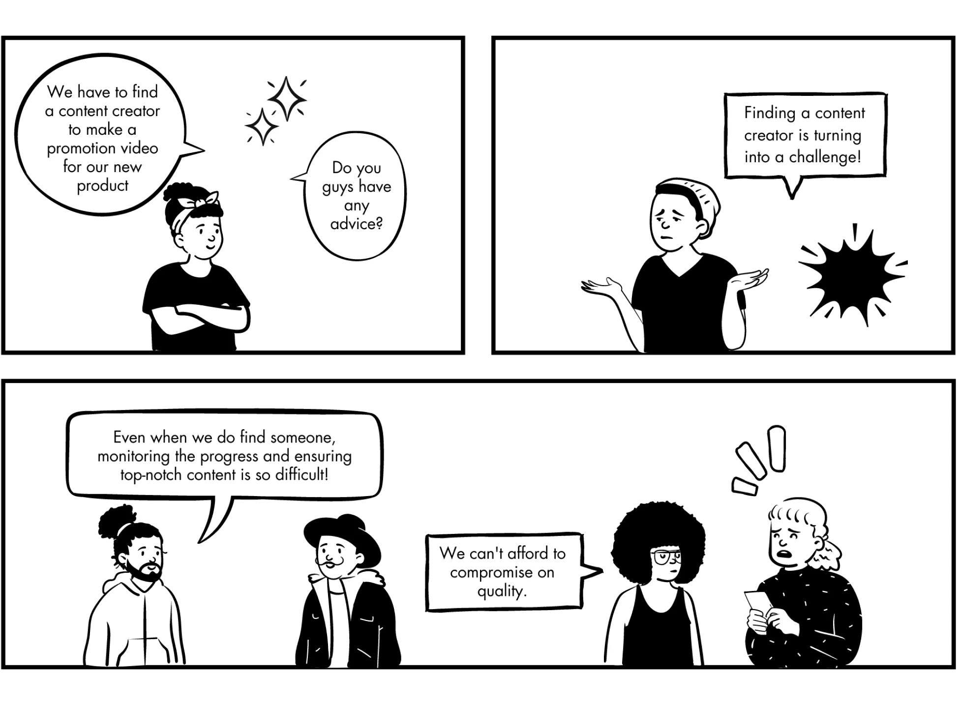
Storyboard of businees clients
The scenario is a business meeting. They are trying to find a content creator to make promotion videos. However, finding the right one and monitoring the quality seems to be hard.
Take-aways
The clients users are mainly facing difficulties as following factors: difficulties in finding suitable creators; monitoring the process and ensuring the quality and lack of communication;
Existed Platforms
We have looked around our direct and indirect competitors, and here are some feedbacks we collect:
How might we
Connect businesses with skilled content creators and ensure a transparent experience from start to finish?
Ideation
Design Goals
User Flow
As we are focusing on the client side procedure, we visualized the User Flow.
Design Iteration
Iteration
Before
After
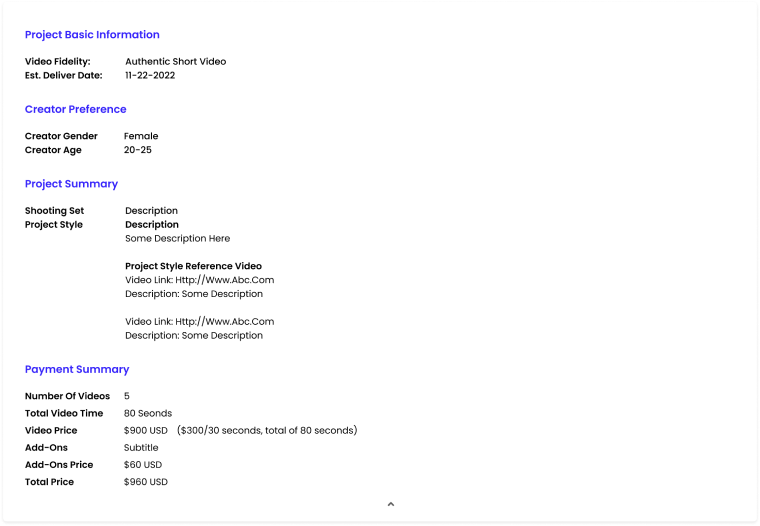
New design simplifies the text for better readability, optimizing space allocation to reduce excessive white space, and introducing a more intuitive presentation for improved user understanding.
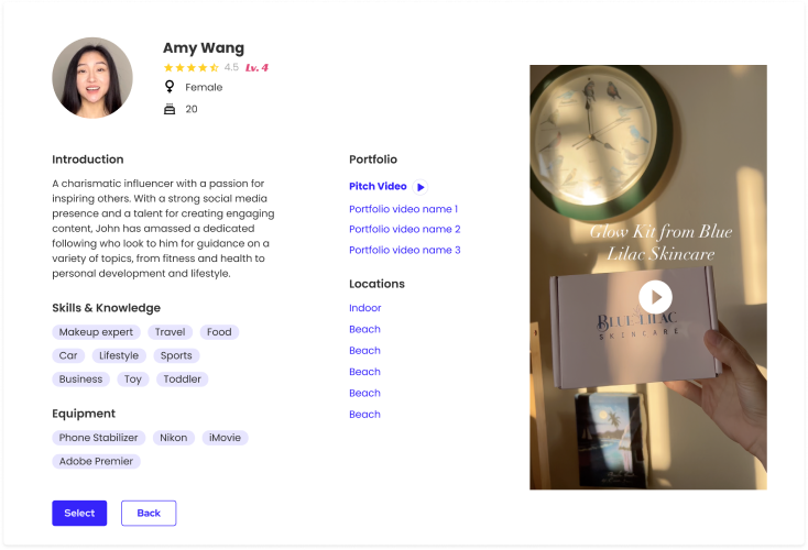
Before
After
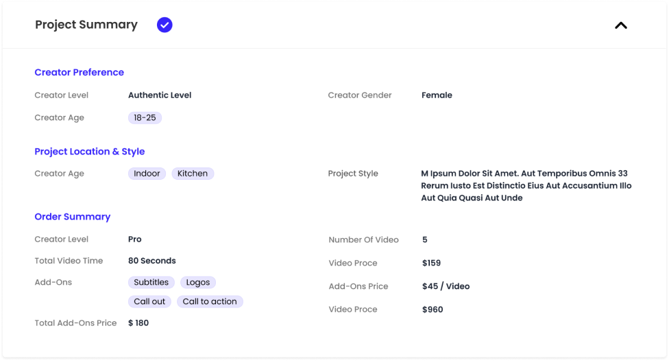
New design introduces a clear information layer to enhance content visibility and comprehension. User could click the card to enter the detailed page, but in the first sight, they could have more impression on each creator.
Before
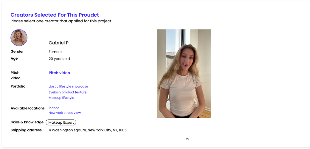
After
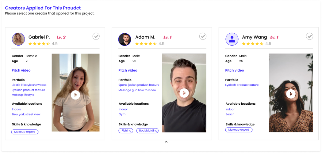
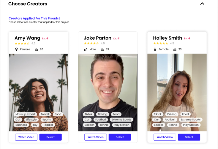
New design optimizes space utilization to minimize excessive white space, prominently displaying comprehensive skills and equipment information.
Before & After Comparison
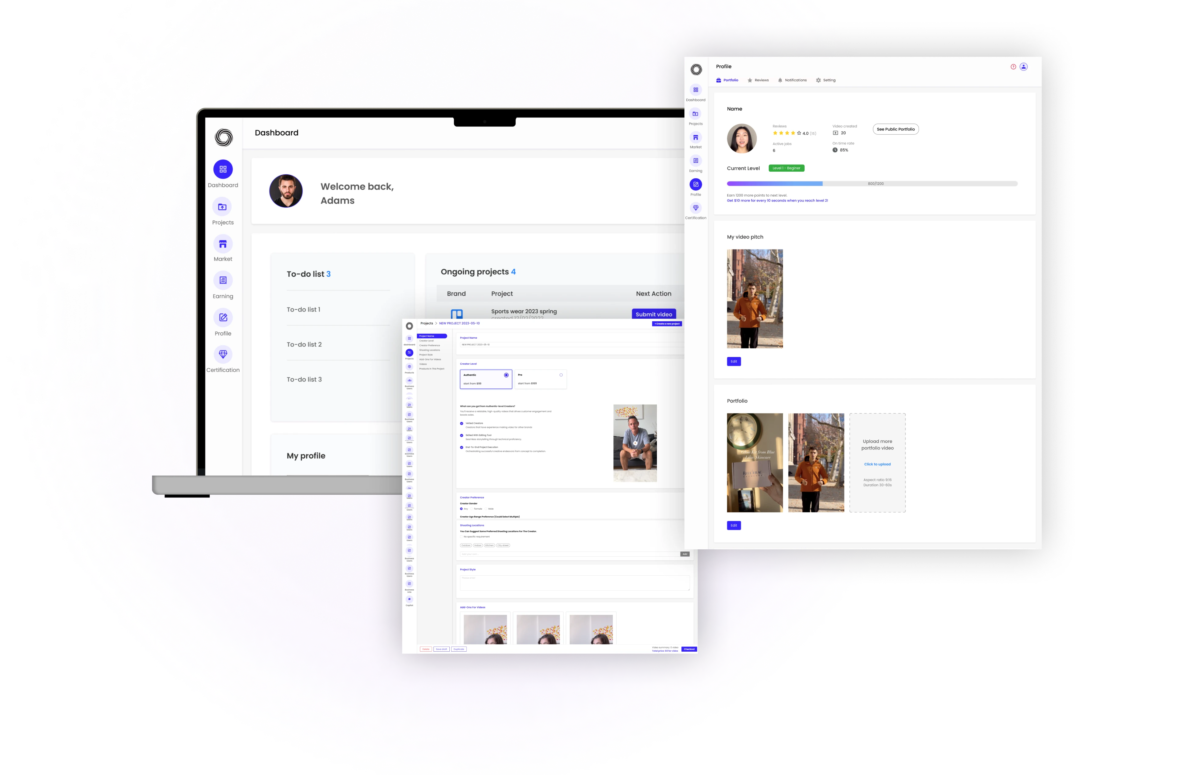
Final Design
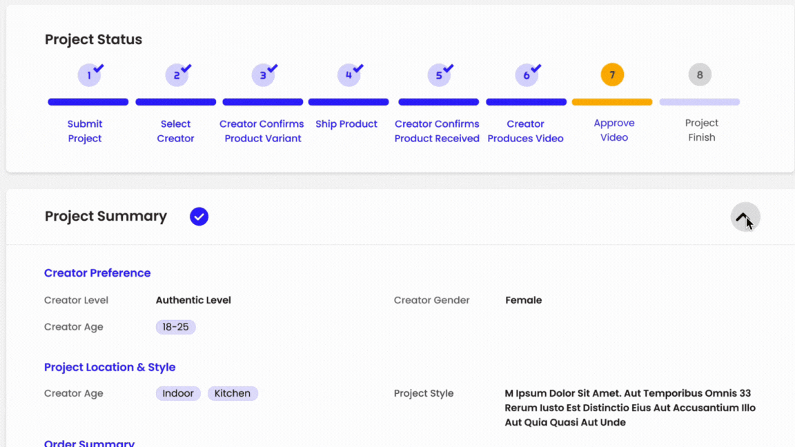
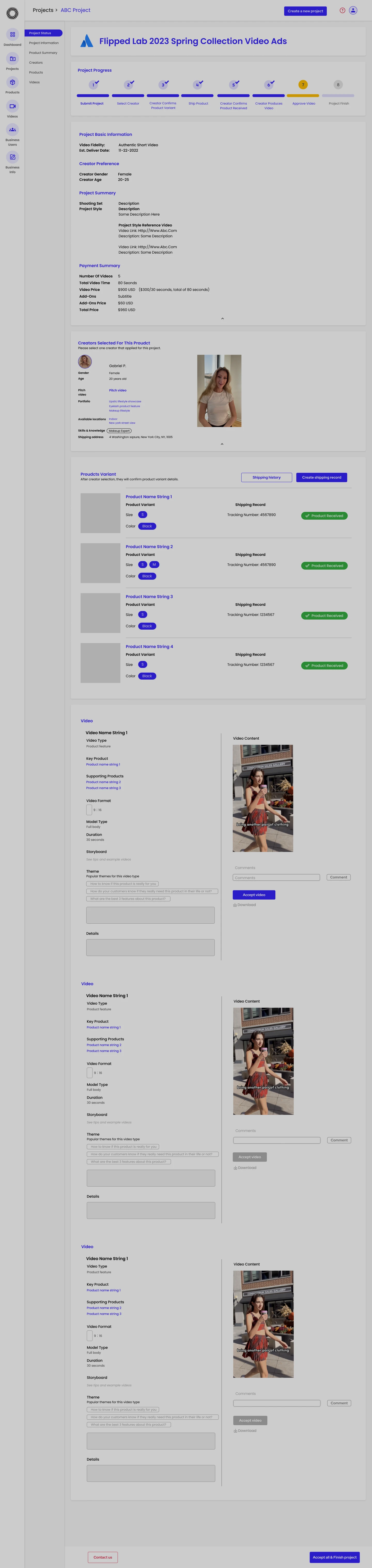
Progress Bar
It shows the progress of the whole collaboration. When you're done with a step, it has a tick sign and you can fold it up
Pain Point
Lacking of monitoring, visually not clear and not efficient
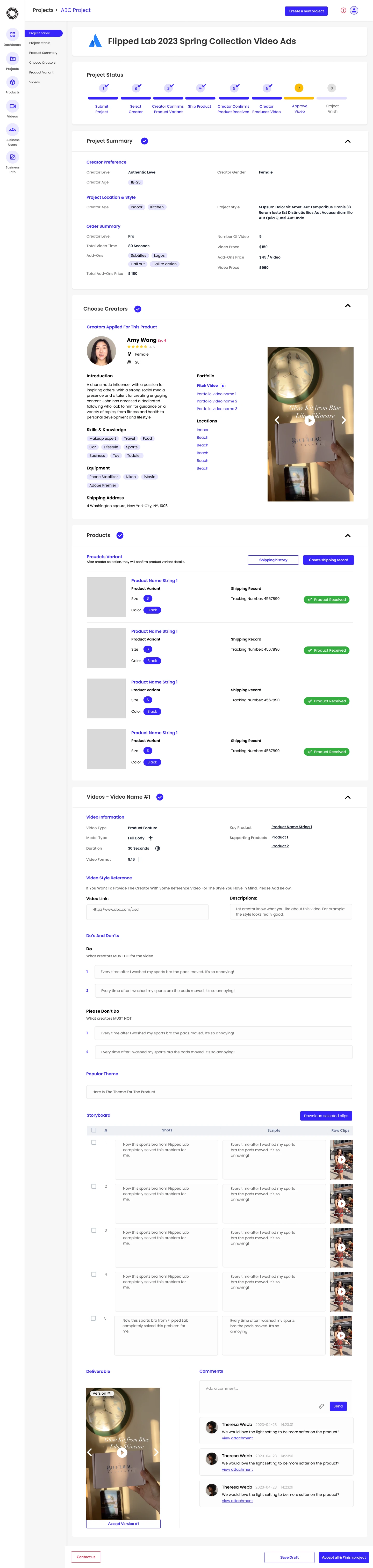
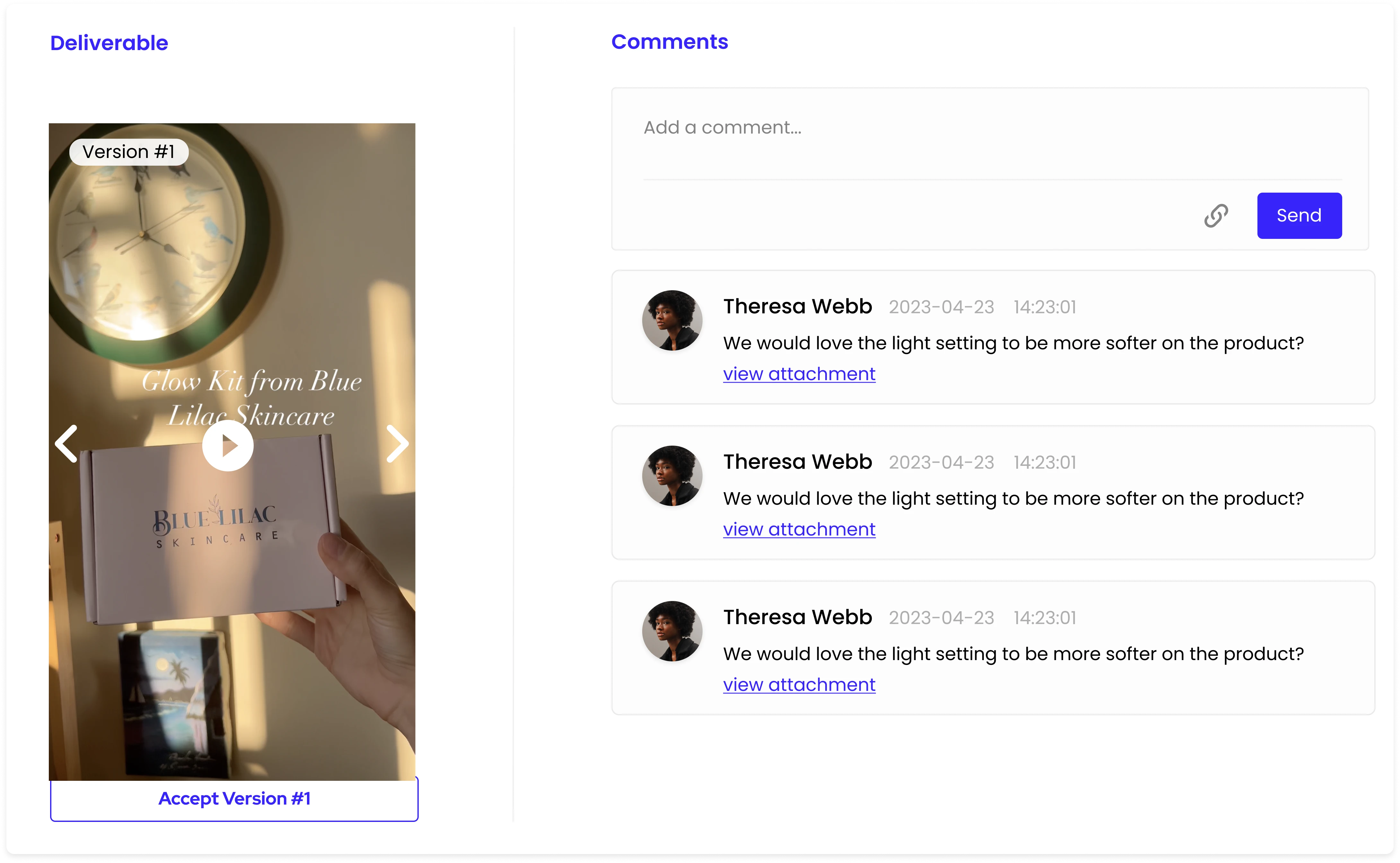
Communicate with creators
Leave text comments, image, and links
Pain Point
Lacking of consistent communication
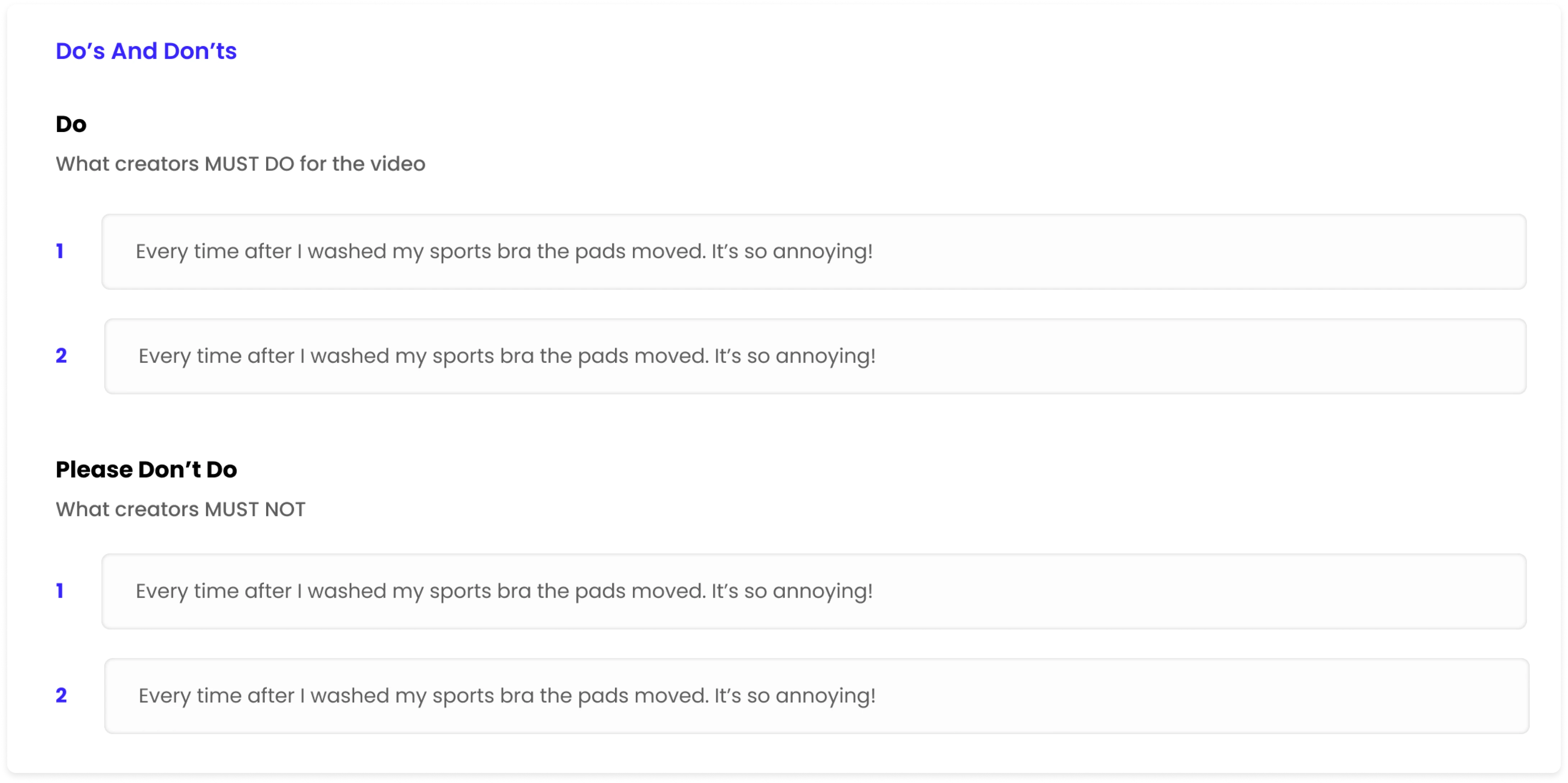
Do’s and Don’ts
Emphasize on crucial points and red flags to creators
Pain Point
Lacking communication and not enough personalization
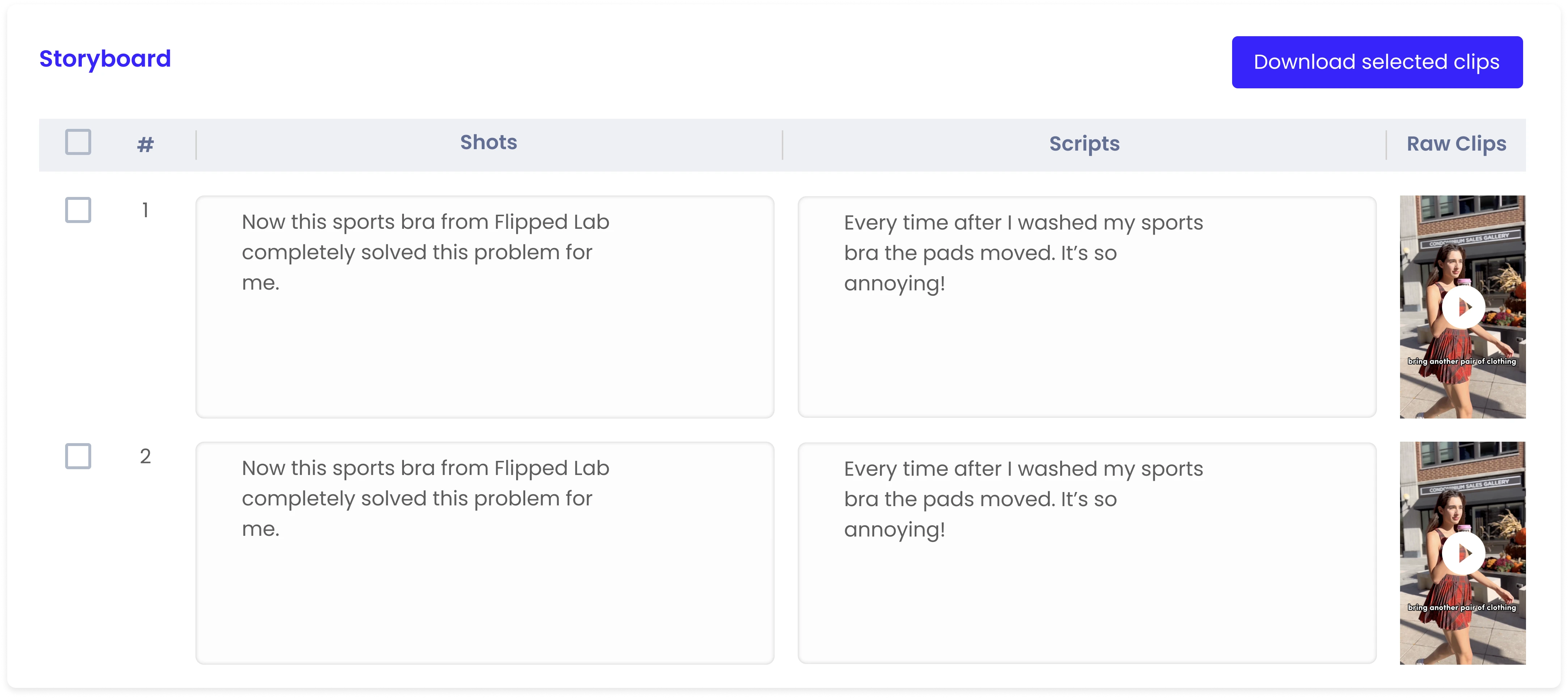
Storyboard
Leave text comments, image, and links
Pain Point
Lacking of consistent communication